This past Saturday, I casually made a statement that, to me was an obvious fact. “Blue, as in Blue, the noun.” In my courses, I am surrounded by wonderfully brilliant people with neat skill sets and wouldn’t you know it, not 2 milliseconds after my utterance, two people chimed in that Blue, the color, is an adjective. In fact, they claimed, all colors were adjectives. My point was entire unrelated to sentence structure and word classification, so I moved quickly on, but that interaction struck me.
How can you treat colors only as a modifier of a thing?
To me colors are things themselves. So I wrote this retort then next day.
I have loved color for most of my life, but like most things in a Know-it-all’s life, I didn’t ever think deeply about it. As a photographer (for almost 30 years), I was drawn to the tonality and simplicity of the Black and White image but have always strived to develop my skills at capturing the beauty of the world of color around me.
My first color duel was with my now ex-wife who scoffed at my color matching blue and orange (complementary colors) in my outfits. Then, I was incredulous to find that colors that were obviously orange to me were red to her and many others. I was shocked. And curious.
In the intervening years, I have spent many periods trying to either understand or master color. I discovered that I see different shades and values out of each eye. My left eye sees with a slight orange shade and my right, a more blue (warmer and cooler temperatures respectively). In digital photography you learn quickly that White Balance is the new variable to understand when coming from film. With White Balance, you are adjusting the range of frequencies your sensor captures given the temperature of the light you are trying to capture. You’ll often see cool temperature light as the standard setting in digital screens. Most modern screens are adjustable, so that Blue Light Filter is changing the Temp. or the screen from cooler to warmer (It’s not a filter).
Plus, don’t get me started about color accuracy when printing photography digitally. I own a $1,200 color spectrometer to control both my monitor and prints from my color and black and white printers (yes, I have both). It is a headache controlling for ‘color spaces’ (many dozens, but RGB and CMYK are the ones you’ll know), and printers (they are insane), and developing code (ICC profiles) for every media your are printing on because different papers reflect ink differently! Printing is a (fun) nightmare!
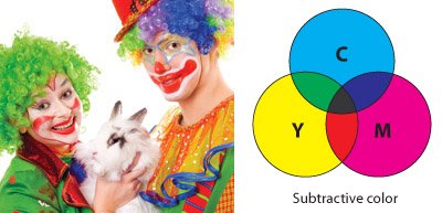
CMYK (Cyan, Magenta, Yellow, Black) are the color spaces used in most inkjet printing. You’ll see that in the cartridges.
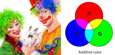
RBG (Red, Blue, Green) are the ways most computer monitors display color. By subtractive color, they are simply meaning that, because you are putting color down, if you want to make the color lighter, you need to put less ink (hence the overlap in the Venn get darker). RGB is created through little flashlights emitting light, so if you want the color to get lighter, you make it brighter (hence the lightening effect when the colors overlap).
from https://www.castlepress.com/page/rgbcmyk
Light is graded in Kelvin (like a temperature) which sounds weird, until you remember (or realize) that light is electromagnetic waves wiggling through space and their frequency, in addition to changing their perceived color, changes their actual temperature. Red literally is the hottest color.
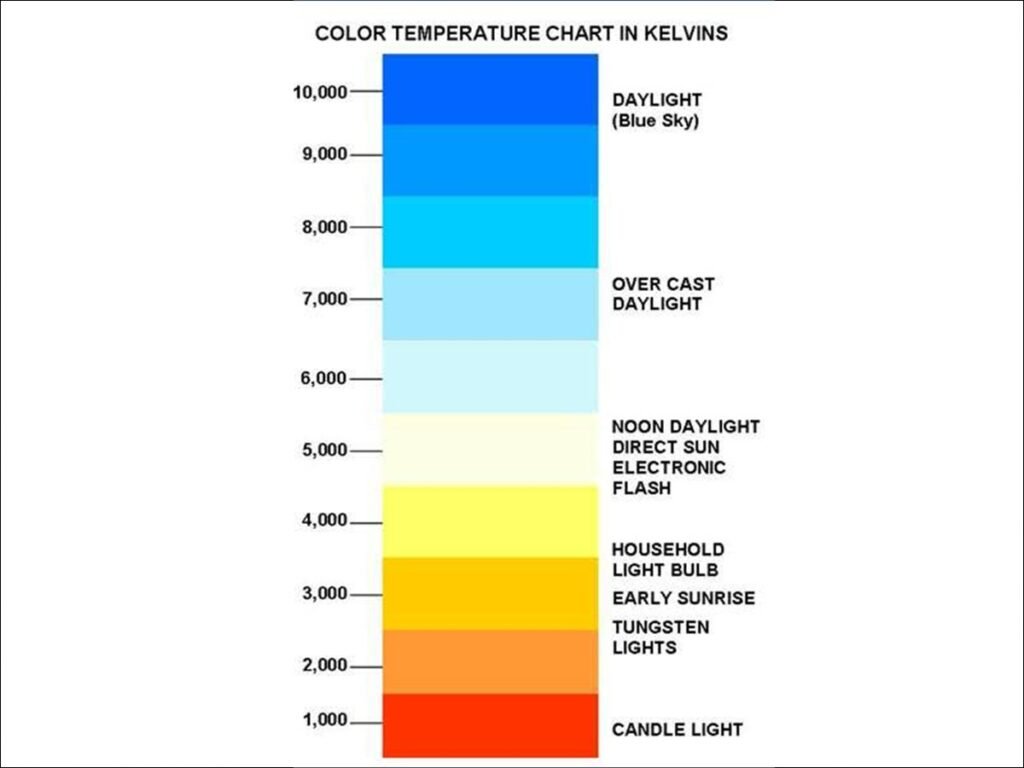
Put a prism into sunlight and place a thermometer on the individual cast rainbow colors and you’ll find blue is colder than red. Ultra-violet and Infra-red are simply color of the light spectrum that are invisible to us. They are the colors that exist just past the visible spectrum our eyes have evolved to see, but they are there. And yes, Ultra-violet is colder than blue, and Infra-red is hotter. That is actually how those invisible colors were discovered, when a smarty pants put a thermometer just past blue and red and measured their temps. I cannot get over how neat that is.

Those differentiations in color are actually different wavelengths of the same thing: the Electro-magnetic spectrum that includes basically everything in the universe…it’s all just a big wiggle (probably). The tiny sliver of that spectrum that makes up visible light should humble all of us that think that our senses give us access to the truth of the universe. They do not.
As a wavelength, what we call Blue light is between about 450-495 nanometers in size (very small amplitude) at a frequency of about 670-610 Terahertz (very fast). That means Blue is a thing, as long as we agree that that color that we see when light oscillates at 670-610THz is Blue. We could call it red, but the color of the light would be exactly the same, regardless of the label.
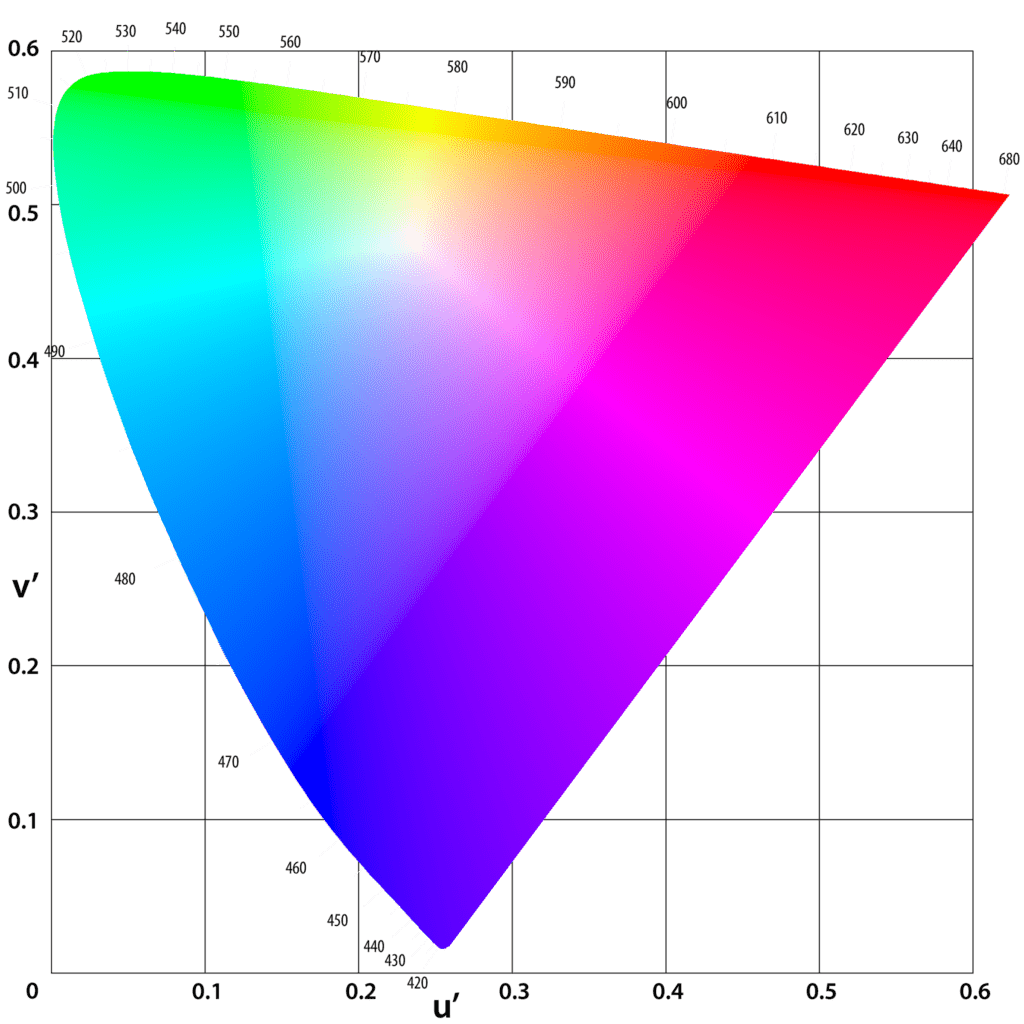
Isn’t it beautiful!
Then there is the fact that a green leaf is not green and is in fact, closer to being any color but green. What we think of as light is really a jumble of photons wiggling at different frequencies. Different recipes of those jumbles create different temperatures of light, but everything you see is visible because those jumbles bounce off of it. How those jumbles behave when it bounces is where everything you perceive as color comes from. (You can see this with color filters on a black and white film, but let’s not get into that!) When lights hits an object, because of the nature of the material, some wavelengths are absorbed and other reflected. Reflected light is where the labels of colors exist for humans. We can’t see all of those frequencies jumbled in a beam of light, but when light reflects off of things, we do.
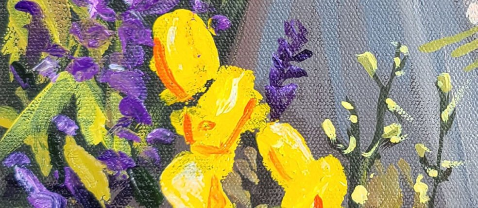
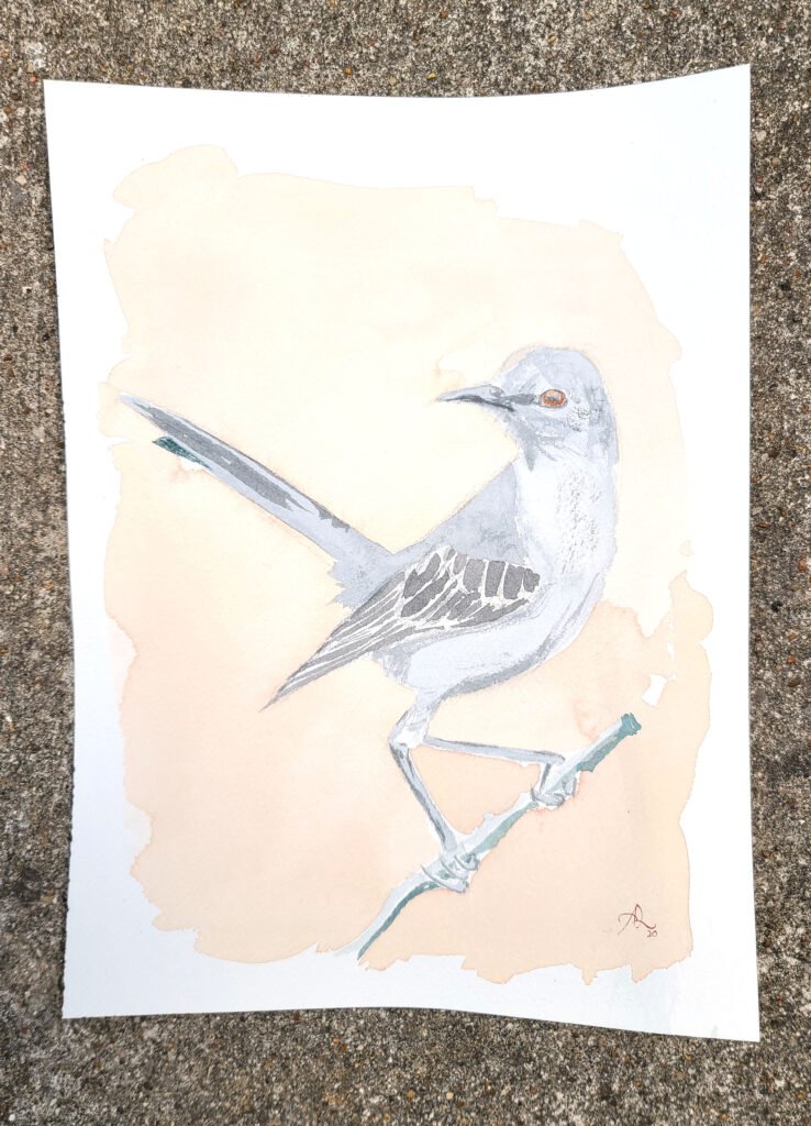
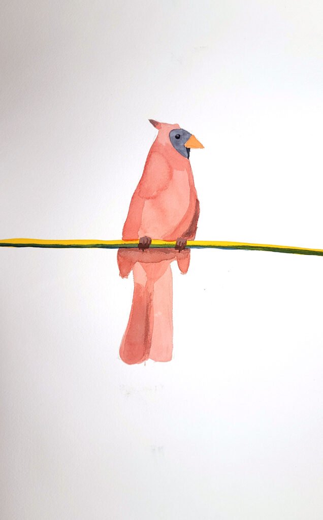
My most recent journey into color has been in painting. Starting with watercolor, I began learning the ‘names’ of all of the neat colors I could buy. Ultramarine Blue, Quinacridone Violet, Madder Brown, Naples Yellow, and so many colors with metals in them, from Lead to Cadmium. The names gave me power to discern and you know how much I love discernment! With watercolors I barely mixed them, only adding complementary colors or darker shades to create shadows. I learned a few recipes that look great, but if I need a green, I didn’t mix it, I used a green I bought and lightened it or darkened it.
It was with oils that I learned to mix. I was shocked to learn and practice that you can create any color (but the most extremely pure blues, yellows and reds) from any other color. Give me a weird greyish green. I can make it any other shade of any other color in a few simple steps. That thinking set me free in my watercolor, knowing that colors are not that complicated and can be controlled.
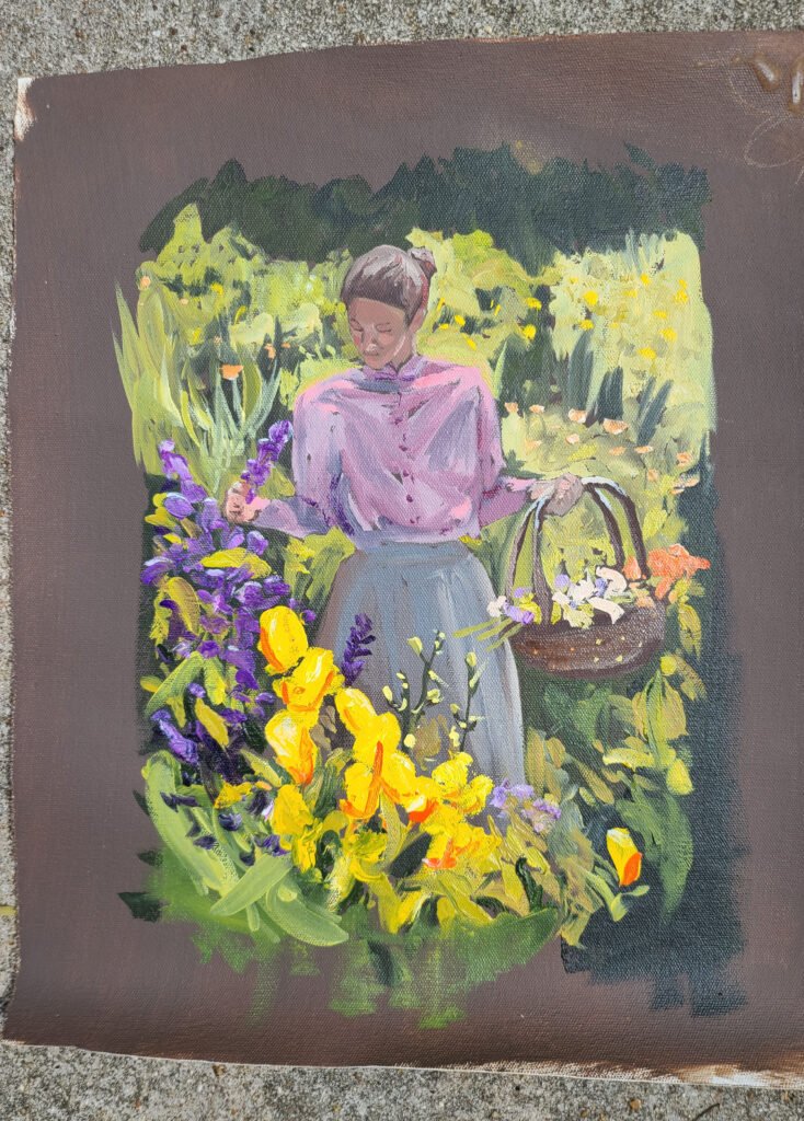
Though I mixed a lot of my oil paint, I still bought a ton, and that brought me back to the names.
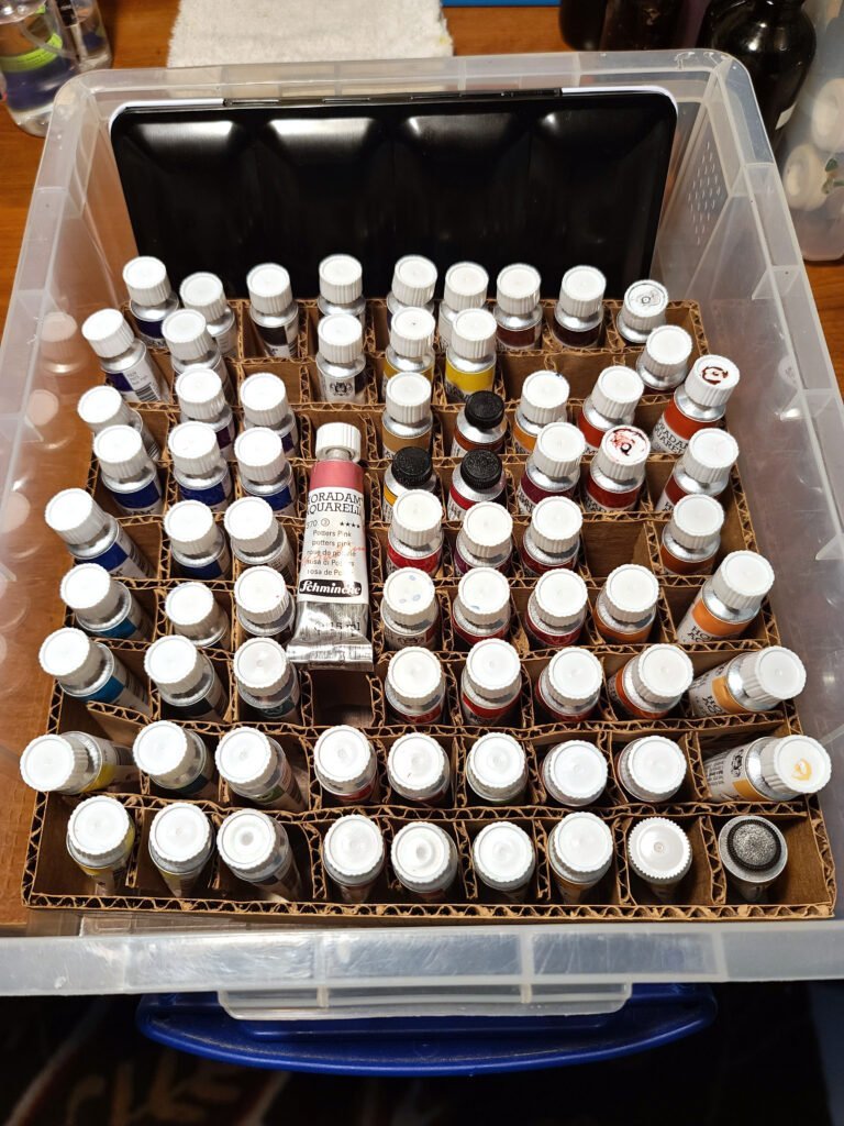
Watercolors! 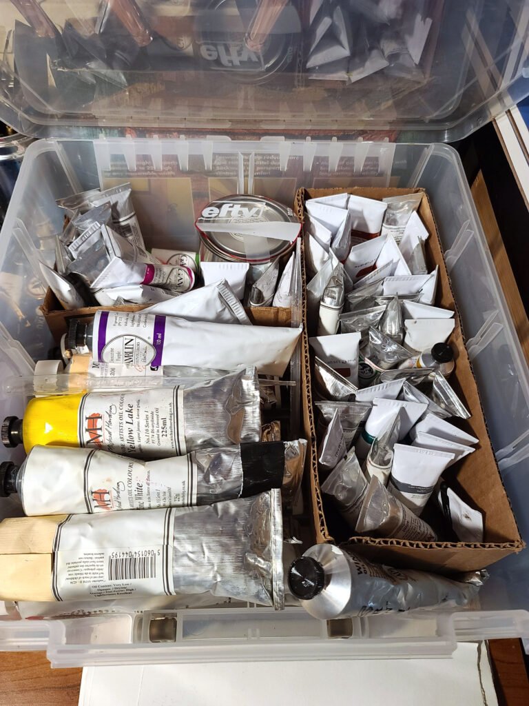
Oil Paint!
Every brand had different names and yet, I was hearing that they are the same colors. Investigating how oil paints are made cleared all of this up for me. It turns out that the invention of pigments is one of the most impressive stories of science and ingenuity in all of history (after the discovery and isolation of the elements of The Periodic Table). Originally, they were all made from natural materials, often from far away lands (Ultra-marine, beyond the ocean). Today they are almost entirely (but not all) made from inorganic synthetic chemistry. This allows for a more sustainable supply and a more stable chemical. As you may have seen when you see the fading of light on an old sign left in sun, ‘Color Fastness’, or a pigment’s resistance to fading in sunlight is important and now, normally quite high.
Understanding that all paint manufacturers use the exact same pigments to make their paint was so helpful in understanding that there is such a thing as a consistent, tangible model of color that exists outside of my unempowered biased perception. Yay!
Those color names could be correlated with the actual color they would be on the canvas! Whaaaat? Remember Madder Brown? In oil from Winsor and Newton, they use two pigments PBr7 and PR177. But as a watercolor from Schmincke, the pigment is PR206. Winsor and Newtons watercolor with that pigment is called Alizarin Crimson Hue. Cool huh? Gamblin oil and Schmincke watercolor share the same affinity for PB29 when making their Ultramarine Finest, so you’re probably good there.
Naples Yellow? Michael Harding oil paint is made with PBr24 while Schmincke watercolor’s is with a mix of PW6, PY53, and PBr24. I could go on, but now you can look it up yourself the next time you’re looking for a weird color. Look up the manufacturer that makes the paint with that weird name, then the pigment, then look for other names from other manufacturers. Am I the only one that’s excited?
Lots of interesting things about painting and light come up when trying to match a color. That is an exercise I suggest all humans do at least once in their lives. It is surprising the hard. The paint section of the home depot is a good place to start. Look at an object in your home, then go to a hardward store and, from memory, try to find the exact match on a paint chip/color card. Have fun!
One issue is that the qualities of light are different in different places, i.e., different jumbles. Then different objects that are the same shade of red look completely different under different light. This quality is local color vs. perceived color. There is the true color of a scarf, but it will change when different lights are cast upon it, or when surrounded by things of different colors (bounced light).
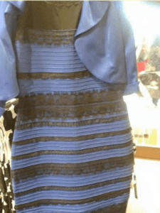
A great example of this is the viral sensation, ‘The Dress’, where there was a huge, species-wide disagreement about the color of the below dress.
What color is it?
Most believe it to be Black and Navy, but a surprising percentage could not unsee a Gold and White dress. For real, though! Computer monitor and brain/eyeball wiring differences are probably mostly to blame, but the below demonstration of local color versus perceived color may help explain, also.
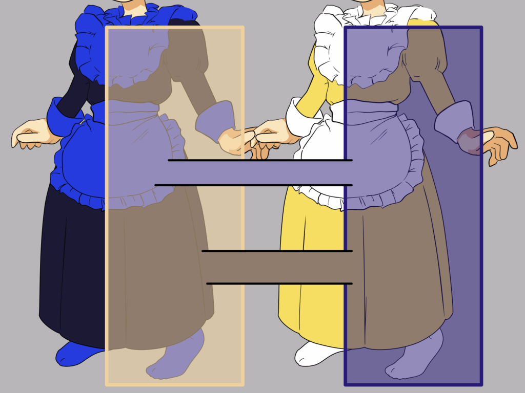
Here are two dramatic examples painted by the great James Gurney from his book ‘Color and Light’. Those colors are exactly the same, yet our brains (the most unreliable of squishy things) fills in the gaps and makes them different.
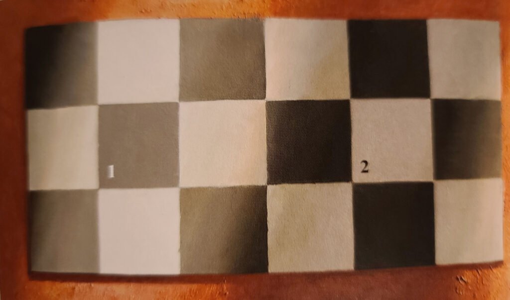
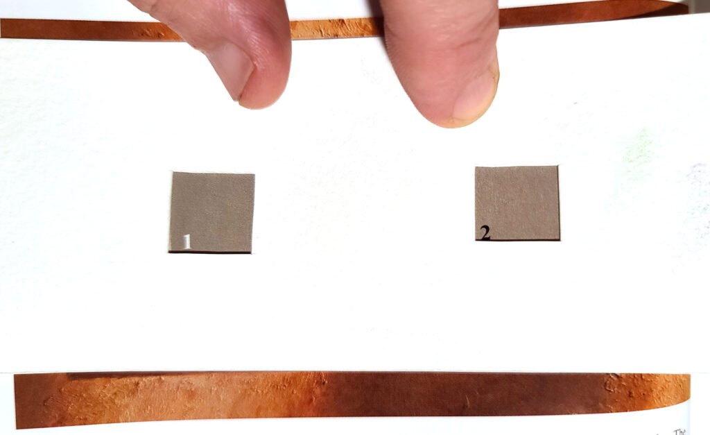
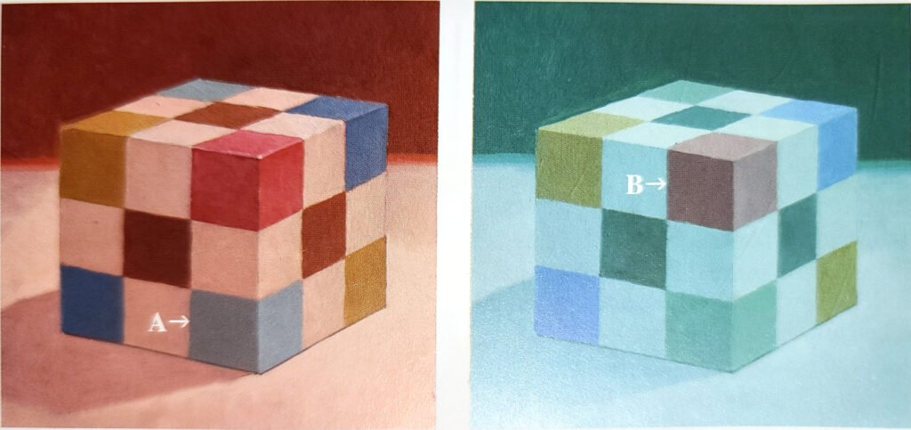
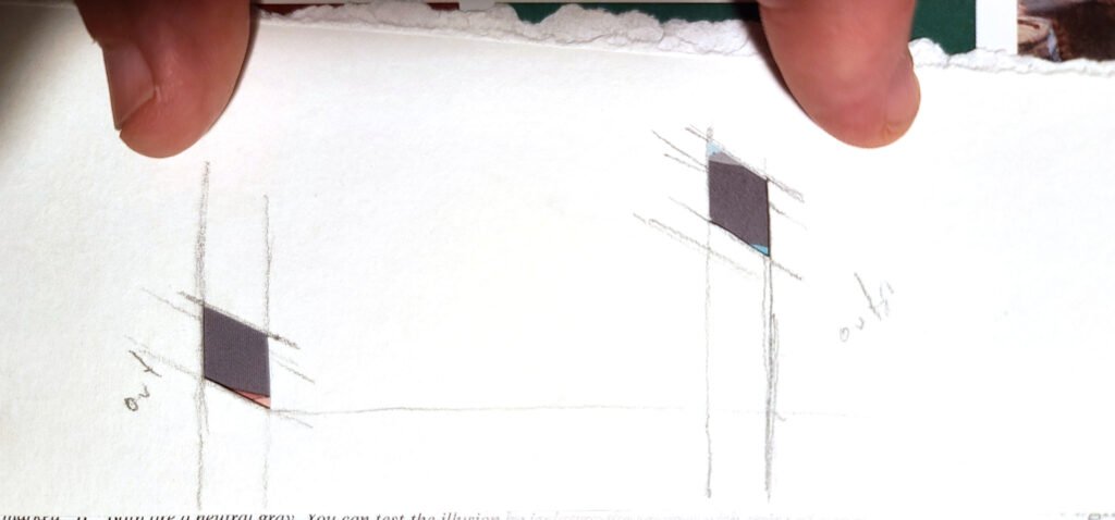
I know, right?
Then we get to the fact that things can be shiny or matte, and that changes their perceived color dramatically. That is important when all oil paint is shiny and all watercolor paint is matte.
Plus, we did not talk about value, aka, how light or dark a color is at all. For the artist, that is priority numero uno when it comes to painting life. Nor did we distinguish the word saturation, aka, how blueish is this particular blue. All these things (and more) are taken into account by competent artists.
With all of this said, I hope you are at least a bit infected with my fascination with color. I treat color like a noun when I see the world. The leaves aren’t green. I am seeing green. I am witnessing the quality of the light as its particular jumbles bounce and play off of the world around me. And although, yes, mostly they are treated as adjectives, consider giving colors a promotion in the world you inhabit. They are a thing. A thing to be experienced, like a sunset.
Here’s a photo I took yesterday (6.28.20) of my driveway. I first witness this bird as a flash of yellow (the fastest color for humans to perceive).

Thanks for indulging me in sharing my love for color, the noun.
Till We Talk Again,
Andrew
The database for all pigments across all brands of paint. You can get lost here and have a looooooooooooot of fun if you’re into this kind of thing.
http://www.artiscreation.com/Color_index_names.html
